
LightLab
Creating the industry’s gold standard.
LightLab Imaging, Inc. pioneered the development of Optical Coherence Tomography (OCT), a high-resolution imaging modality that applies advanced photonics to medical imaging applications. Their latest product was about to take image resolution to a whole new level.
Challenge
- LightLab needed to create awareness of the company, its new C7 product, and its next-generation FD technology, which was a vast improvement over the existing OCT technology.
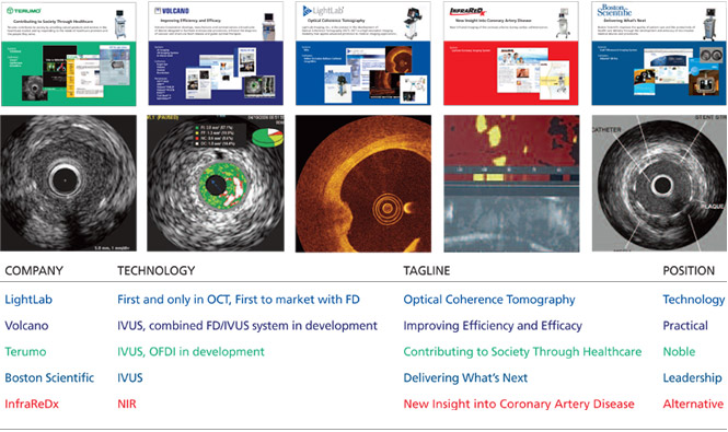
- LightLab was in a race with a large competitor to get FD technology to market. Even though it evolved from OCT technology, the competitor was successfully positioning OCT as outdated, putting LightLab in a difficult position since it had positioned itself as the experts in OCT technology.
- LightLab needed to find a way to take advantage of its leadership position and frame the discussion to its benefit.
Solution
- Focus on LightLab’s clearly superior imaging capabilities, since cardiologists care more about image quality than the underlying technology
- Develop a look and language that positioned LightLab as the leader in this new category
The story behind the work
We did a thorough analysis of LightLab — how its technology and products compared to its competitors; its present position in the market; its product hierarchy, including both current and planned products; and any outside influences which might affect the brand.
Audience
Interventional cardiologists working in Cath Labs in U.S., Europe and Asia.
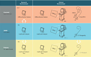
Product Architecture
Findings
- Cardiologists care about the end results — not the technology
- LightLab offers extremely high resolution intravascular imagery compared to the competition
- LightLab’s current positioning is hinged on a technology, and technologies can become obsolete
- Reposition the company as a technology innovator
- Execute a “shared brand” strategy (build brand value into the company and the product)
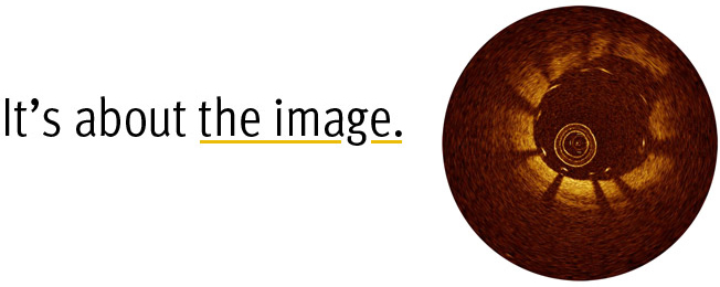
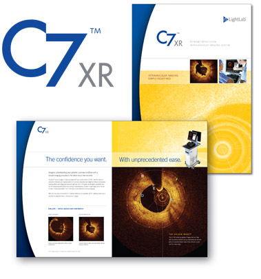
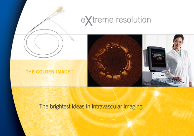
We developed a look that emphasized the superior resolution of their image, introducing the concept of “The Golden Image®”. We also developed a tagline which elevated the company’s position beyond their current OCT technology and created a new category to describe their superior image — Extreme Resolution.
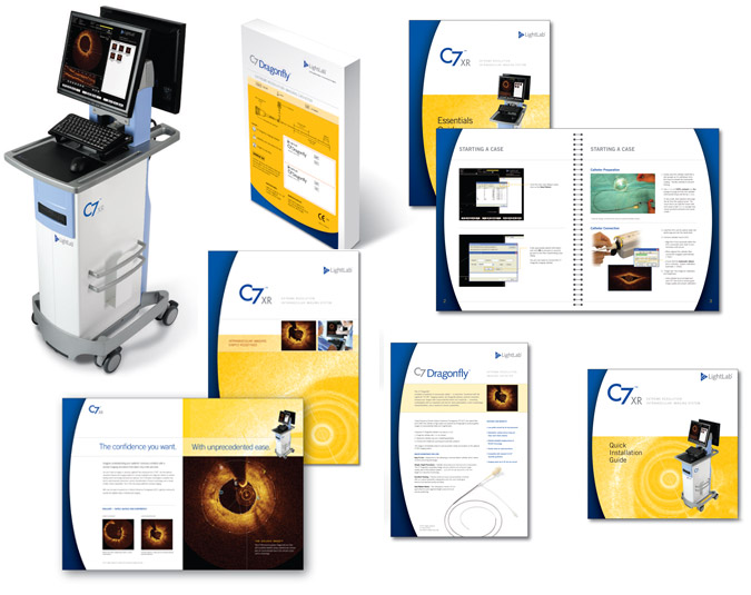
We applied the brand elements.
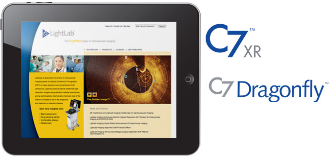
The brand continued to be applied to a wide range of applications, including collateral, packaging, and the outer casing of the product itself.
 As LightLab’s software engineers showed me comparisons of their image and their competitors’ images, the superiority of Lightlab’s image was obvious. Typical ultrasound images generated by competitors’ systems were foggy and gray. The high resolution images generated by Lightlab’s system were bright, golden and incredibly sharp. One engineer said “We sometimes see our images in other people’s presentations and it’s obvious that it’s our image because it’s unlike any other out there.” That was the key. They had something of great brand value. We developed a look and a language, trademarking the term “The Golden Image” and created a whole new category of image quality we called “Extreme Resolution”, which we then abbreviated and added to the product name — C7XR.