
When conducting competitive brand research for clients, I find that more and more tech company brands are looking and sounding more and more alike. That’s not branding, that’s the exact opposite of branding. The point of your brand is to distinguish your company from others and to communicate what is unique and special about your company. If you look and sound like everyone else in your space, it communicates to your customers that you are no different than the others, or worse, that you are merely following their lead.

Planes, Trains and Automobiles, ©Copyright 1990-2018, IMDb.com, Inc.
In a classic scene from the comedy Planes, Trains and Automobiles, traveling shower curtain ring salesman Del Griffith (played by John Candy) has ended up driving in the wrong direction on a divided highway. The driver of another car, traveling in the same direction, but on the correct side of the highway, screams a warning to Del and his passenger Neal Page (played by Steve Martin). “You’re going the wrong way!” After some frantic shouting back and forth with the other driver, Del and Neal conclude that he must be drunk because “How would he know where we’re going?” Regardless of the product that you make, or the service you provide, if you’re brand looks and sounds just like your competitors, I don’t need to know where you’re going to know that you’re going the wrong way.
So, how did we get to this place where there is so much uniformity in technology brands?
Fitting in.
It seems that making your brand similar to your competitors’ brands will communicate that you belong in that market. It’s the same urge that motivates teenagers, commuters and motorcyclists to dress like one another. Their “brand dressings” communicate to the world that they’re part of a group, and there is comfort in that belonging. But when developing your brand, it’s important that you be aware of these urges and place them where they belong, as secondary objectives. Remember that the purpose of your brand is not be like everyone else, it is to be different.
Fear.
In nature, blending in and remaining still helps to keep animals alive. In the business world, blending in and standing still almost assures death. It’s hard to be different. It feels dangerous to be bold, but that’s exactly what a brand needs to be to separate itself from the background noise. Be bold. Be courageous. Fly.

Does your brand blend in or stand out?
Trusting your instincts.
You’ve been told over and over to “listen to your gut”. But there are many times in life when instinct runs counter to what’s best for you—like deciding to sell as the stock price is falling, or choosing to run when your clothes are on fire. When evaluating your agency’s brand presentation, be aware of the instinct that tells you to go with what’s safe or comfortable. Evaluate the proposal based upon whether it accomplishes the objectives that were defined at the outset. Ask yourself whether it will resonate with your audience? Discuss whether it successfully conveys the value that you offer? Consider whether or not it expresses a unique brand personality? Resist the urge to base your decision simply on whether you like it or not.
Focusing on the obvious.
Whatever industry you are in, it’s likely that your highest level objectives are the same as your competitors’. If it’s internet security, you want to communicate strength, which suggests particular colors, shapes and symbology. If you’re in healthcare, then safety is paramount, which again, suggests particular design choices. It’s why you will see so many medical device brands based on blue and/or green, and so many security companies based on black and primary colors. When developing a brand that will stand out, you must go beyond those highest level communication objectives to find a position this is unique.
Following the leaders.
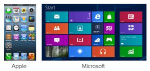
In all design disciplines, styles change and trends emerge. And though following a design trend can initially communicate that your brand is current, it also places a virtual timestamp on the brand. A year or two after its launch, that site, or brochure, or graphic—which seemed so current a year or two ago—is beginning to look “so yesterday”. For technology companies who must remain current, it’s challenging. One year the trendy design style involves glass button effects with soft shadows like the early iPhone app icons, the next year it’s primary colors and flat graphics like the Windows user interface icons. These trends are often driven by the industry leaders, and everyone else just falls in line. This chase to remain current is just one more reason why technology brands begin to look more and more alike. Strive to develop a brand whose core elements are timeless.
Leaders lead and followers follow.
The commoditization of beauty.
Attractive design used to be costly. A company who could not afford talented designers, high-quality photographers and great web programmers found it difficult to keep up with those companies who could. However, free website templates, low cost stock imagery, and the mainstreaming of design software have made it possible to look like the big guys without having to pay like the big guys. Continuous advances in graphics software have made sophisticated visual techniques (tricks) easier and easier to execute, and available to more and more users. A technique which once may have involved 10 or 20 steps by a talented artist can now be accomplished with a single click in an office application. Those visual techniques which once helped to distinguish brands are now available to all.
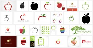
Inexpensive stock imagery makes branding seem easy.
Devaluing design.
Good design is a symphony of thoughtful considerations, the combining of words, colors, shapes and images to persuade, inform and educate. Good design communicates with the conscious and the subconscious. Good design is the product of a thousand choices—not just of color, but of hue, and contrast, and value. Not just of fonts, but of weight, and style, and leading, and kerning, and tracking. Not just of images, but of composition, and style, and tone. Not just of shape, but in what those shapes communicate. The ability to orchestrate all this requires talent, years of study, and many more years of practice. These abilities cannot be learned by watching YouTube videos. The decision by companies to put their brand in the hands of budget-friendly marketing specialists is another factor in the me-too brand movement. Lacking the talent or training to do otherwise, it’s natural to mimic what has been seen and done by others.

Where have I seen this logo before?
A note about med tech.
Medical device marketing is highly regulated and as such, there is a tendency for med tech companies to err on the side of caution in all matters relating to branding and marketing. Even when not making clinical claims, the tendency is to avoid anything that might attract the attention of the FDA. That fear reinforces all of the factors listed above and further ensures that the brand will blend in rather than stand out. In addition, the inherent nature of med tech is that, at the highest level, all companies share the same purpose—to improve patient care. When every company shares the same goal, and operates with regulatory handcuffs, it’s no wonder that they find it difficult to separate themselves. Those factors do not preclude differentiation, they only define the space that you have to work within.
So, what’s the solution?
Differentiating your brand in the high tech or med tech space is not easy. It requires the courage to do what others are afraid to do, and the conviction to stick to your guns. It requires an objective sense of where you stand in relation to your competitors, and a clear and distinctive brand position that is meaningful, relatable and true. And it is nearly impossible to do all of this without the aid of an objective creative partner who can guide you through the process.